
Layouts are always a fun creative challenge for me, and often my awesome customers let me dicide how to layout their quilt design. For both Classic and Custom T-Shirt quilts, I take several factors into consideration when I am designing a layout:
1) Customer Desires
2) Color-light, dark, and medium
3) Graphics-size and shape and what I think of as their weight.
Of course customer desires are taken into consideration first. No sashing verses sashing and T-Shirts that need to be made central or need to be put together in the design drive the rest of the process. Customers who want a Classic T-Shirt quilt can even create their own layout using the grid provided in the ordering tab or by laying out the shirts and providing me with a picture of the layout.
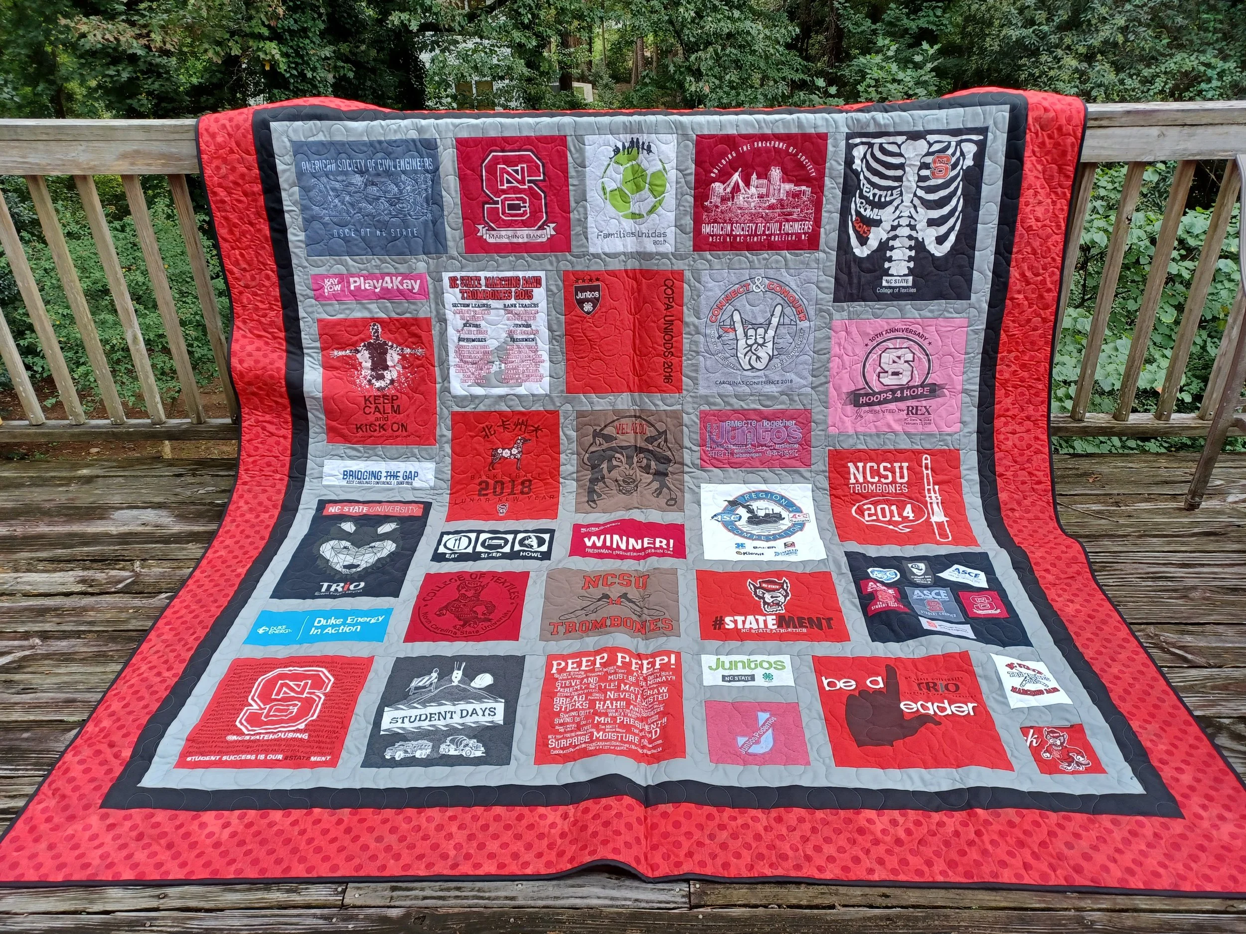
An NCSU thematic Custom T-Shirt Quilt. Gray solid sashing surrounds each shirt and is the inner border. Black solid fabric is the middle border and binding, and Grunge Red Dots are the outer border. In this layout I worked to evenly distribute the red shirts by using the gray, black and white shirts to do so. The heavier or larger graphics are also separated by smaller or word graphics, too, creating an interesting and balanced design.
After taking customer desires into account, I think about color. Typically T-Shirt quilts are comprised of a variety of shirt colors…unless the quilt is a thematic one, like a college quilt or an activity driven quilt. The same color questions hold true for those theme-based quilts, too, though. I tend, especially with Classic quilts to separate the blocks into light, medium, and dark once they have been interfaced and cut to size. With Custom quilts I think of the size of graphics initially. For color, I try to keep light, dark, and medium evenly placed in the design, keeping like shades separated by the other types—too many dark, medium or light colors in one place can unbalance the overall quilt design. The same is true of the actual color of the pieces; like colors need to be dispersed evenly in the quilt.
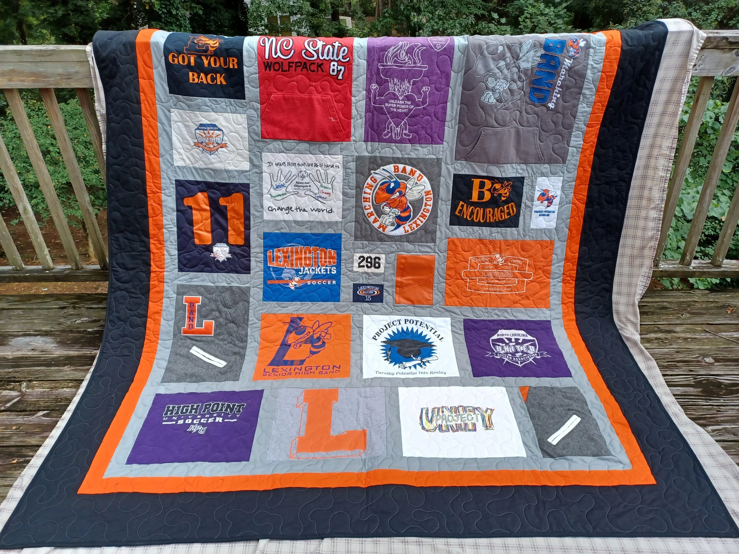
A Custom T-Shirt Quilt with no sashing and a royal purple outer border. There are a lot of white shirts in this layout, but that doesn’t harm the design because the white pieces are evenly placed in the overall design.
Once color is taken into consideration, the type of graphic and its size is considered for each shirt in the design…for instance, a T-Shirt quilt might have shirts with a single line of text, tiny front logos, or round graphics. I endeavor to separate the same type of graphics to create interest and again, to balance the quilt. Round graphics can be placed beside square graphics, while big, bold pictorial graphics might be placed next to smaller text graphics.
I know I say it a lot, but my goal is for my customers to love their quilts, so careful, thoughtful layouts are the way I design. Plus layouts are like a puzzle, especially with Custom T-Shirt quilts, and I really enjoy that process. All of the considerations I have discussed here work in tandem and are recursive. I think about them all simultaneously while I design a layout.
In this blog, I have focused on T-Shirt quilt layouts, but a layout is just as important to a memory quilt…or any quilt really! I am excited to share, as I can, what I am working on in the studio right now. I am having a lot of fun!
Sending Quilty Love,
Ginger
Reading Now: Yes, I did start the next Louise Penny book, Bury Your Dead, and I am still working on You Can’t Go Home Again, by Thomas Wolfe. I picked up Margaret Atwood’s memoir (of sorts, as she says), and a critical literary book about the Romantic poets, which are both coyly waving to me from the shelf. I am not above having three…or more…books on the go at once…
I listen to NPR several times a week in the studio as I work. I recommend it if you really want an unbiased new source. Be kind and have a great week.